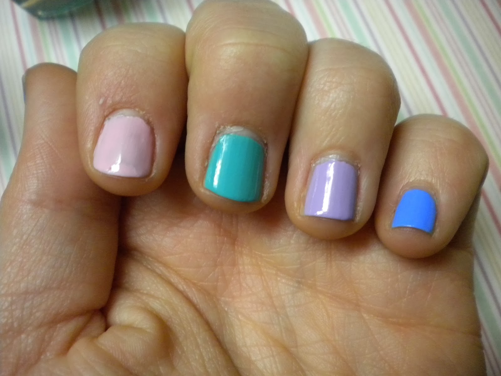
Seeing as the amount of nails I have to paint isn't endless, a theme was decided and then a few select colours were chosen. Pastel which includes 270 Lacey Lilac - Sally Hansen, Turquoise Lagoon - Maybelline, 505 Mind The Gap, Victoria - Rimmel and Rose Porcelaine - Maybelline seeing as these colours complemented each other perfectly. This is the first coat:
Fitting the pastel theme so far, maybe the blue needs to be a little lighter but that's probably the picky-ness coming through a little too much. This isn't being picky but at this point all of the nail polishes needs another layer seeing as none of them are really opaque enough yet to get the best of the polishes overall...
That's much better for my liking which is probably a little bit picky which is becoming apparent through this little blog... Now as mentioned earlier the design is going to be a trio of dots and relatively simple seeing as it's got to look good on both hands. Not brilliant on one and terrible on the other. Additionally a large dotting tool was chosen so that it would fill the nail polish 'frame' as it were and much easier to get three in a straight line. Hopefully like this:
Making sure all the colours were included in the simple art, the accent dot colour was changed every time so that it was the colour of the nail to the left of it (does that make sense? I am not sure...) Simplicity seems to be the best policy seeing as these came out so well aside from the fact that the lines aren't all straight or perfect, this can only really be seen when looking closely! Who'd be doing that except me!?


The colours are lovely together. bold pastels are one of my favs! x
ReplyDeleteBold pastels are a favourite at the moment which is unusual as normally it's bright and bolder the better!
Delete